コンポーネントを使用したカスタムブロック作成
Story Book
エディター構成パーツカタログ。
https://wordpress.github.io/gutenberg/?path=/docs/docs-introduction–page
Component Reference
コンポーネントの使い方を確認できる。
https://developer.wordpress.org/block-editor/reference-guides/components/
Buttonコンポーネントを使ってみる
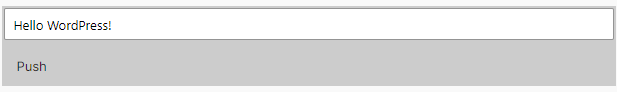
- edit.jsを編集
- Buttonコンポーネントをimport
import { useBlockProps } from "@wordpress/block-editor";
import { TextControl, Button } from "@wordpress/components";

export default function Edit({ attributes, setAttributes }) {
	const { message } = attributes;
	const blockProps = useBlockProps();

	return (
		<div {...blockProps}>
			<TextControl
				value={message}
				onChange={(value) => {
					setAttributes({ message: value });
				}}
			/>
			<Button>Push</Button>
		</div>
	);
}
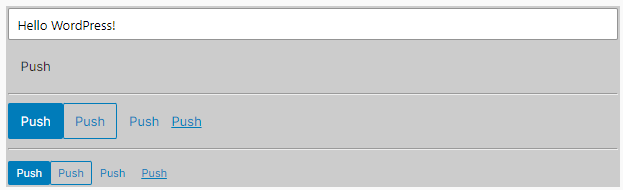
variantを設定
	return (
		<div {...blockProps}>
			<TextControl
				value={message}
				onChange={(value) => {
					setAttributes({ message: value });
				}}
			/>
			<Button>Push</Button>
			<hr />
			<Button variant="primary">Push</Button>
			<Button variant="secondary">Push</Button>
			<Button variant="tertiary">Push</Button>
			<Button variant="link">Push</Button>
		</div>
	);
サイズ変更
			<Button>Push</Button>
			<hr />
			<Button variant="primary">Push</Button>
			<Button variant="secondary">Push</Button>
			<Button variant="tertiary">Push</Button>
			<Button variant="link">Push</Button>
			<hr />
			<Button variant="primary" isSmall>
				Push
			</Button>
			<Button variant="secondary" isSmall>
				Push
			</Button>
			<Button variant="tertiary" isSmall>
				Push
			</Button>
			<Button variant="link" isSmall>
				Push
			</Button>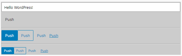
押下状態
			<Button variant="primary" isPressed>
				Push
			</Button>
			<Button variant="secondary" isPressed>
				Push
			</Button>
			<Button variant="tertiary" isPressed>
				Push
			</Button>
			<Button variant="link" isPressed>
				Push
			</Button>